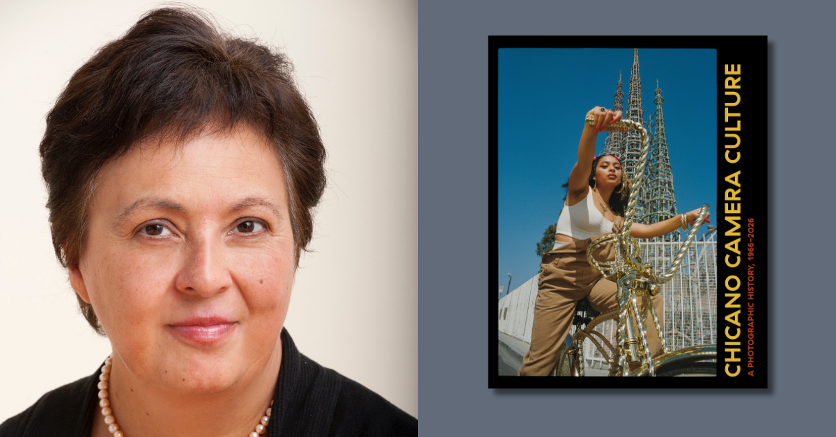
 Paula Becker‘s Looking for Betty MacDonald, the first comprehensive biography of this endearing Northwest storyteller, reveals the story behind the memoirs and the difference between the real Betty MacDonald and her literary persona. In this guest post, designer Thomas Eykemans discusses the process of creating the cover in collaboration with the author and Seattle artist Tom DesLongchamp. He also shares the creation of the covers of three new editions of Betty’s memoirs, Anybody Can Do Anything, The Plague and I, and Onions in the Stew.
There are a million photographs of Betty MacDonald and any one of them could have made a great book cover. The portrait of a beaming bang-free Betty (below, lower left) was inset on many of the covers of her books when they were first published, and Paula describes how this particular image of her was perhaps the most familiar. Regarding The Egg and I:
After only a few months, Lippincott moved Betty’s appealing head shot from the back cover to the front, ditching Bennett’s art. For her readers, the merry pinup-girl author and the yarn she spun were indivisible. From this point on, Egg branded Betty, and Betty branded Egg.

Despite their prevalence, a photo of Betty seemed too static for a biography about her, and definitely too black and white. Her rich life, warm personality, and merrily snarky attitude required something more energetic and colorful. Tom DesLongchamp is a Seattle-based artist and illustrator whose imaginative style is perfect for the challenge.
It was difficult to decide which Betty to feature in the portrait. Tom chose to work in two directions: the classic beaming Betty; and more reserved Betty with bangs, which was her signature look. After several rounds of sketches and color tests, it was clear that Beaming Betty was a wonderful image but lacked the depth of her character. Bangs Betty is a much deeper representation with a mysterious expression that could be interpreted in a variety of ways.


Bangs Betty was clearly the right direction, but it felt too dark and contemporary to place her in the era she lived. This gem from Paula’s book helped define the final stages:
“Mrs. MacDonald has green eyes, auburn hair and an unquenchable energy. Her voice is quick with life, and it warms each sentence. Her expression, never placid, shifts readily from amusement to anger.”—Cosmopolitan, 1947

In the final cover design, I framed the portrait in an oval shape to recall her bestseller, The Egg and I. The typefaces, Bodoni and Futura, hearken to popular styles of 1930s and 40s. Their conflicting qualities (serif vs. sans-serif; Didone vs. geometric) help mirror the complex juxtapositions of Betty’s own personality.
Watch an interview with Tom about his process at KING5 here.
Betty’s New Editions

The new editions of Betty’s books, Anybody Can Do Anything, The Plague and I, and Onions in the Stew, provided a challenge of their own. Previous editions of each book ranged from wildly illustrative to purely typographic. I felt strongly that they should have a unified look with some element of variety, but the only example of this was a plain set of reissues published in 2000.

Some of the older editions were wonderfully designed and quite inspiring. My first instinct was to have the covers illustrated, which resulted in a lot of fun sketching exercises.


However, as work progressed, it became apparent that the title took on more prominence and the imagery became almost secondary. Illustrations had already been done so well in the past, and I was worried that any new depiction of Betty would compete with the stunning portrait that Tom DesLongchamp had already produced for her biography.
I began exploring type-only cover designs that would carry the energy of the books in a way that felt fresh, yet recalled the era. Album covers for jazz records from the 40s and 50s provided ample inspiration.

Eventually I settled on three basic colors and three simple shapes to distinctly represent each setting: energetic red rectangles for the bustle of the city; gloomy blue circles for the cold sanitarium; and lively green triangles for the forested island of Vashon.

To give the covers a rough and homemade feel, which seemed akin to Betty’s do-it-yourself attitude, I decided to cut the final designs from paper.


