
As part of a series of guest posts, UW Press Designer Dustin Kilgore walks us through the various design concepts that eventually brought him to a book’s final cover:
Craig Peariso’s Radical Theatrics: Put-ons, Politics, and the Sixties analyzes the theatrical actions of the 1960s counterculture movement and finds that, contrary to popular belief, their over-the-top antics were more than attention-seeking displays. From Occupy Wall Street and Flood Wall Street to the creative Keystone XL pipeline protests, such theatrics are still considered effective by the diverse groups within American society expressing political dissent.
To mirror the book’s approach of using contemporary 1960s source materials in its analysis, I thought the book’s overall design should feel as much from that time period as possible without being nostalgic or resorting to tired stock protest imagery.
The image research included print ephemera and documentary photography of protests as diverse as the October 21st March to “Levitate the Pentagon” to humble Quaker pray-ins in front of the White House.


An early (very rough) concept featured a double exposure of the Yippies’ Abbie Hoffman:

Even though the Yippies are discussed at length in the book, I abandoned this direction in order to avoid favoring any one particular group on the cover. Since the activist movements covered in the book are diverse in their issues and approaches, I was looking for the middle ground between irreverent over-the-top ’60s countercultural imagery and more conservatively presented civil rights marches as seen in this figure from the book’s interior:

The photo ultimately selected for the cover is from a 1967 anti-Vietnam war protest in Wichita, Kansas. It echoes the book’s contents because it’s a bit outside our 21st century stereotypes about the ’60s counterculture: no long hair, no peace signs, no bell bottoms etc. The activists’ performance clearly calls into question the legitimacy and morality of the Vietnam debacle and other imperialist excursions. I think it cleverly reframes the debate to ask, “Just who are the radicals?”

I liked the idea of featuring marionettes because it quickly conveys “theatricality” and also recalls an incisive collage by former Minister of Culture of the Black Panther Party, Emory Douglass:

Inspired by their pithy signs and marionette props, I wanted the typography to have the same grassroots ad hoc energy by making the type hand-drawn.
Since this is an academic book, I researched ’60s Students for a Democratic Society (SDS) posters and other university protest flyers. As a Phil Ochs fan, I was especially drawn to one of his hand-bills, which is an interesting cross between a church event and a rock show. (Note the event’s sponsors.) The DIY mix of disparate typography definitely informed the final cover design and the interior design as well. The interior of the book looks like a Herbert Marcuse monograph from the time, with Century Schoolbook as the main text typeface.

I experimented with a few different approaches for the hand-drawn cover type, using cheap brushes, poster paints, and a chisel tip marker.

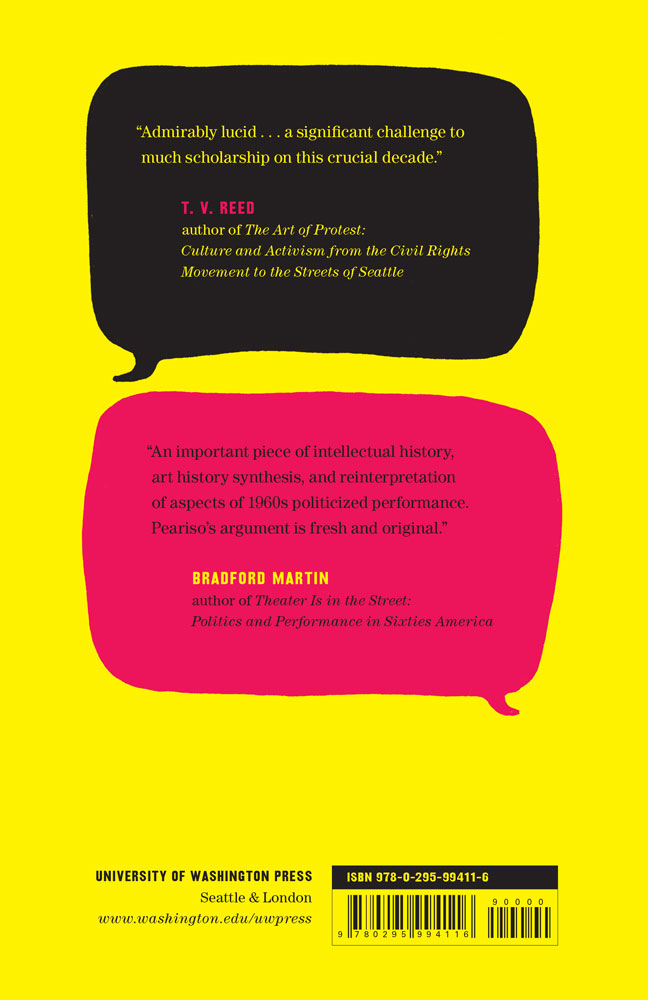
Housing the back cover blurbs in comic book speech bubbles adds a final touch of hand-drawn levity. I wanted to turn the barcode upside down or have it a bit askew, but that was rocking the boat a bit too much.


