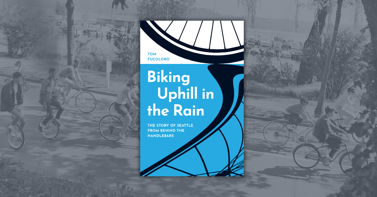
In Bike Battles: A History of Sharing the American Road, James Longhurst, a historian and avid cyclist, traces contentious debates between American bicyclists, motorists, and pedestrians over the shared road, from the nineteenth century to the current day. Here, designer Dustin Kilgore walks (or pedals?) us through the various design concepts that eventually brought him to the book’s final cover.
Bike Battles is such an evocative book title and it hits close to home for me. As a daily bike commuter, I felt added pressure to do this book justice. Since everyone uses street signs, the “sharing the road” reference seemed like a natural way to speak to the cultural history the book investigates, as well as both sides of the bike/car divide.

Although this provocative one-liner didn’t fly for obvious reasons, I did end up returning to this early concept after trying photographic and illustration-based approaches:
 I’m sure every bicyclist can relate to this scenario, but this direction didn’t speak to the depth or complexity of the book:

I thought this photographic approach conveyed the marginalized status of cyclists in most cites, but this direction didn’t quite capture the energy of the book’s title:

One of a cyclist’s greatest fears is running into an opening car door, so I tried (unsuccessfully) to capture this scenario in a photo shoot. Ranjit Arab, the editor who acquired Bike Battles, was cool enough to spend an entire Saturday afternoon helping me with a photo shoot and lending his mint condition 1971 Schwinn Centennial to the cause. Even though it didn’t pan out as a book cover, it was extremely helpful to realize that concept and see if it had traction. The photos ended up looking too staged and it was nearly impossible to work in the subtitle, but it was a learning experience—and a lot of fun too.

When the photo shoot and illustration concepts didn’t work out, I realized rather than solely focusing on one particular “bike battle,” I should revisit my earlier versions of the cover to see if there was a possibility to expand the ubiquitous street sign concept to better reflect the broad scope of the book. The crossroads “X” on the final design refers to both the bike v. car cultural battle lines, as well as the crossroads that humanity faces as fossil fuels run out and we struggle to find sustainable solutions to power our lives and our daily commutes.
 The jacket color is the same as the “safety” greenish-yellow/ neon-chartreuse street signs, which is the contemporary update on the school bus yellow color and supposedly the easiest color for the human eye to see.
—
Learn more about Bike Battles, watch a book trailer, and see if James Longhurst is bringing his bicycling book tour to a city near you at www.bikebattles.net.