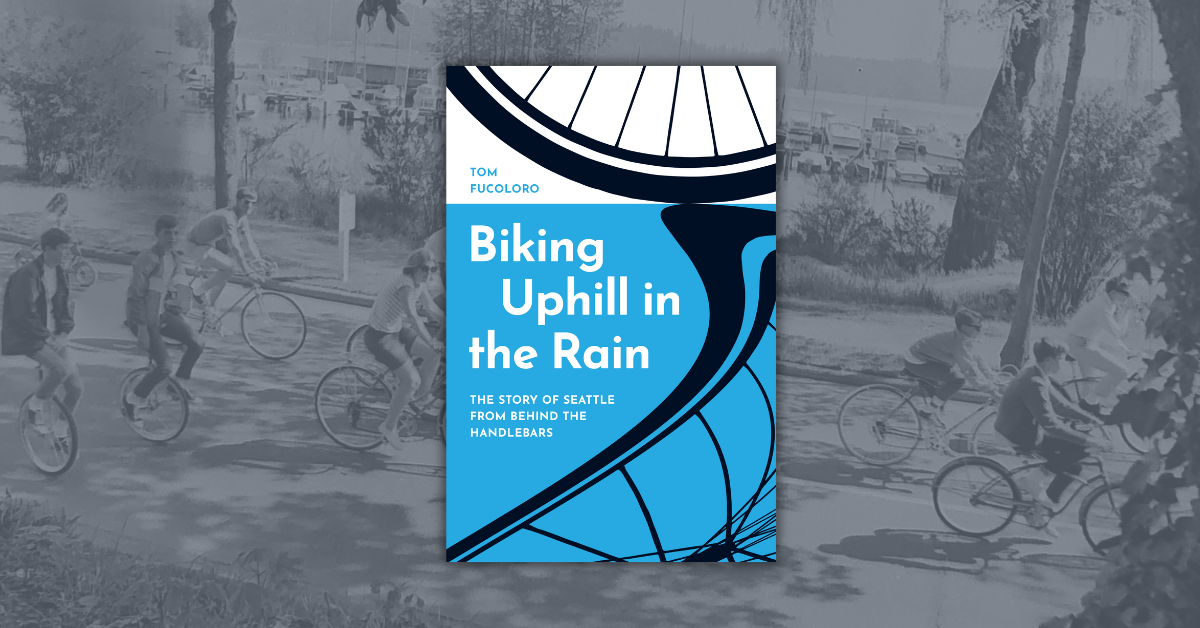
Lewis George Clarke published the story of his life as a slave in 1845, after he had escaped from Kentucky and become a well-regarded abolitionist lecturer throughout the North. His book was the first work by a slave to be acquired by the Library of Congress and placed under copyright. In 2012, the University of Washington Press published a facsimile edition of Clarke’s book introduced by his great-grandson, Carver Clark Gayton. Today, UW Press senior designer Thomas Eykemans walks us through the creative process behind producing the cover to this important publication.
The title of a book can go a long way toward determining how its cover is designed. A short, punchy title can be made as bold and splashy as space allows. Most titles are a bit more descriptive, and require some creative line breaks and typographical distinctions. What, then, to do with a thirty-word title—not including the subtitle or author bylines?
“Narrative of the Sufferings of Lewis Clarke, During a Captivity of More Than Twenty-Five Years, among the Algerines of Kentucky, One of the So Called Christian States of North America, A Facsimile Edition, by Lewis Clarke, with an Introduction by Carver Clark Gayton” provided just such a challenge.

My first instinct was to take the title and simply fill the cover with it. What must have been a purely practical title when Clarke first recorded these stories in 1845 now has an almost poetic quality, and I thought that maybe it alone could carry the design.

Then I saw the portrait of Clarke provided by his great-grandson Carver. He is distinguished and tranquil in the photo, but his eyes seem to hint at the suffering described in the title. The plain humanity of this image seemed just as powerful, if not more so, than the words alone.

The second concept incorporated the portrait and ran the title across the photo in narrow bands. By restraining the photo compositionally, and by adding color, the content of the book began to manifest itself visually.

In working with the interior text design, I came across the original title page, which was a fascinating assemblage of various typefaces. It became apparent that by slicing away the blank lines and overlaying the result, I could achieve the same effect as the second concept while tying the content to the image in an even stronger way.

The cover was selected to be included in American Institute of Graphic Arts‘ 2012 50 Books / 50 Covers competition. From AIGA: “AIGA’s competitions are widely recognized as the most discerning statement on design excellence today, extending a legacy that began more than 90 years ago. The selections from the ‘50 Books/50 Covers’ competition exemplified the best current work in book and book cover design as chosen by a distinguished jury of design peers. Through this competition, AIGA created an authoritative chronicle of outstanding design solutions, each demonstrated the process of designing, the role of the designer and the value of design. The selections have been part of the AIGA Design Archives, in the physical archives at the Denver Art Museum and in Columbia University’s Rare Book and Manuscript Collection at the Butler Library.”